


Back to Work
Merchant Apps Pertamina
Client
Pertamina Patra Niaga
Year
2025
Platform
Web-Based, Dashboard
Role
UX Designer
Scale
Enterprise-Government
Tools
Figma, Miro, Notion
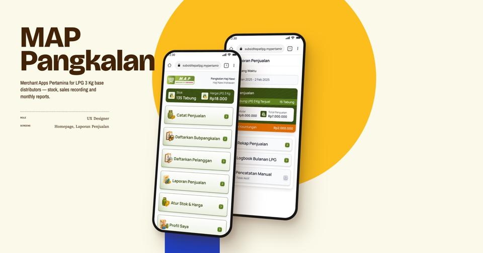
Merchant Apps Pertamina supports the distribution of subsidized 3 kg LPG cylinders in Indonesia. As the UX designer, I tested seller workflows and redesigned parts of the transaction experience. Our team delivered the project in one month and reached 99.5% of the project KPI target.
The platform aims to ensure that subsidies reach their intended beneficiaries through targeted distribution, greater transparency, and real-time data-driven monitoring.
Overview
In this use case, the focus is on how Merchant Apps Pertamina improves the usability of transactions between sellers and buyers of 3 kg LPG cylinders. The application is designed for use across Indonesia, including the country's 3T regions (tertinggal, terdepan, dan terluar), which refer to underdeveloped, frontier, and outermost areas that may face challenges in infrastructure, connectivity, and access to digital services. This diverse context requires an inclusive and accessible design that accommodates people from different backgrounds, levels of digital literacy, and degrees of familiarity with technology.
To understand the sentiment of the intended users, we conducted quick research to assess their opinions and readiness for the project before its wider roll-out. The findings revealed a significant gap between stakeholder expectations and real-world conditions, which could hinder user adoption and the successful implementation of the project.
the problem
- Technical and Usability BarriersMany sellers are reluctant to use the application due to technical challenges, including unreliable internet connectivity, limited digital literacy, and incompatible or low-specification smartphones. As a result, they prefer to record transactions manually.
- Limited Time & Stakeholder ExpectationsLimited time to design the application based on stakeholder requirements.
Goals
- To make the web app experience smoother and reduce technical issues and usability barriers that could prevent users from adopting the platform.
- To prevent broken user journeys and ensure that users can complete key tasks smoothly in real-world conditions.
- Ensuring that stakeholder requirements are fulfilled within the expected timeline.
My role
Conducted usability testing, identified user pain points, analyzed root causes, and designed UX improvements to address the identified issues.
Process

01
Research
The project started with preliminary research involving seven sellers of 3 kg LPG cylinders. The findings revealed the initial problems outlined above.
02
Brainstorming
The design team, project managers, and stakeholders collaborated to discuss the initial problems and generate potential solutions for implementation.
03
Pilot Design
The design team created the first version (v1) of the application to evaluate how well it supported users in real-world conditions before the full-scale rollout.
04
Usability Testing
The pilot design was tested with 32 participants aged 18–60 to capture diverse user perspectives and identify usability issues in the initial design.
05
Design Improvement
Based on the usability testing results, the design team refined the design to address identified usability issues and improve the experience based on users' difficulties during testing.
06
Rollout and Monitoring
The improved design was implemented. During the rollout, the design team monitored the application, maintained the quality, and gathered feedback to further improvement.
Research
A. Objective
To simplify the transaction process for 3 kg LPG cylinders by transitioning to a fully digital system.
B. Method
In-depth interviews and shadowing to identify and assess sellers' behaviors, motivations, pain points when using digital transaction systems, and levels of digital adoption.
C. Respondent Profile
Age: 35–50 years old Stock in shop: 10–20 LPG cylinders Digital literacy: Have a smartphone and are familiar with digital applications Device access: Do not own a smartphone
D. Findings
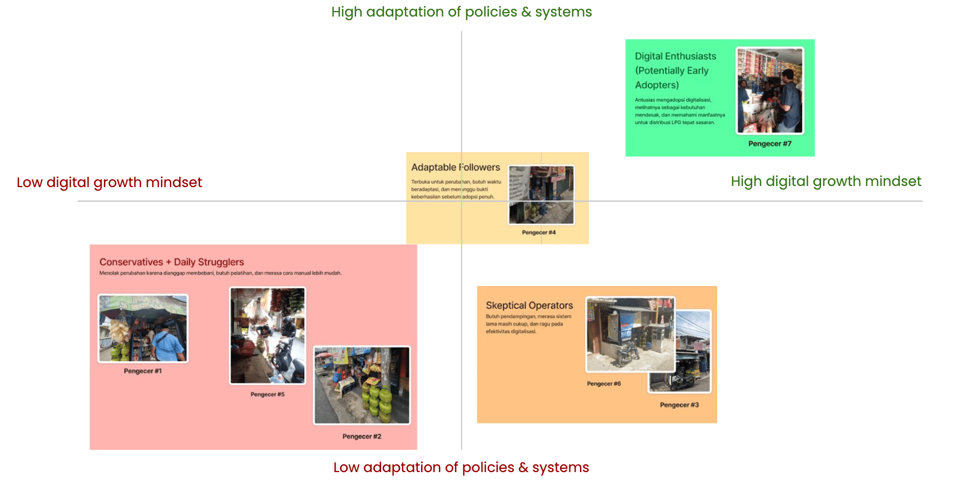
Eager to adopt digitalization, recognize its urgency, and understand its benefits for ensuring the proper distribution of LPG to the intended recipients.
Open to change but need time to adapt, preferring to wait for tangible results before fully embracing digitalization.
Resist change because they perceive it as an additional burden, require training, and prefer the manual system.
Seller #1
Seller #5
Seller #2
Need guidance, believe the manual system is sufficient, and remain skeptical about the effectiveness of digitalization.
Seller #6
Seller #3
Seller #7
Seller #4
Many sellers are reluctant to use the application due to technical challenges, including unreliable internet connectivity, limited digital literacy, and incompatible or low-specification smartphones. As a result, they prefer to record transactions manually. Sellers tend to prefer cash payments over digital transactions because they perceive cash as more reliable and trustworthy. Sellers often rely on their relatives for guidance and assistance in learning how to use the digital application.
Usability Testing
A. Objective
To gather insights and feedback from prospective users on the pilot design. To identify usability issues and improve the user experience to ensure the application accommodates users with diverse needs and levels of digital literacy.
B. What to Validate
Registration Feature: 100% success rate, with task completion in under 4 minutes. PIN Activation: 100% success rate, with task completion in under 2 minutes. Seller Management: 100% success rate, with task completion in under 5 minutes. Transaction Feature: 100% success rate, with task completion in under 6 minutes.
C. Respondent Profile
Age: 18–60 years old Own a smartphone capable of running the application Have experience as LPG sellers
D. Result
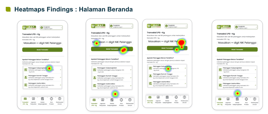
Registration Feature: Success Rate: 73.33% Task Completion Time: 12 minutes Key Issue: Sellers confused the Transaction feature with the Registration feature.
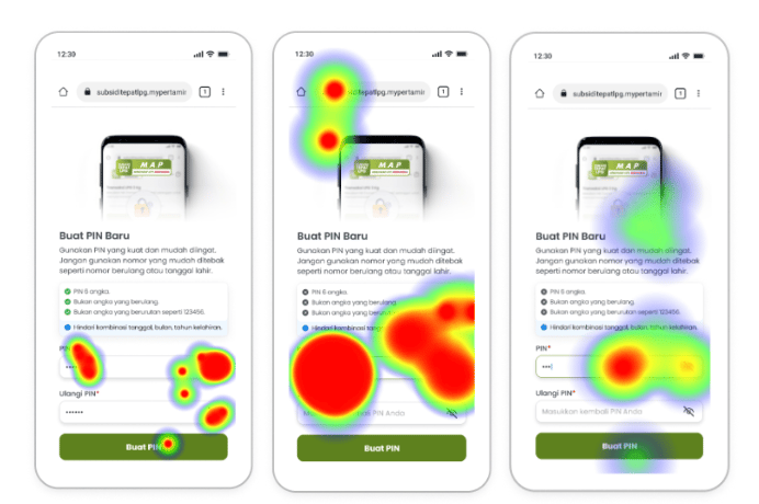
PIN Activation: Success Rate: 60% Task Completion Time: 8 minutes Key Issue: The error message was confusing, and sellers overlooked the on-screen instructions.
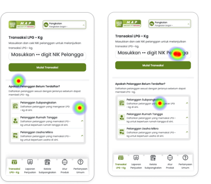
Seller Management: Success Rate: 82.35% Task Completion Time: 1.5 minutes Key Issue: Navigation issues prevented sellers from finding the menu.
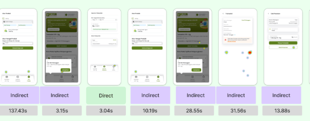
Transaction Feature: Success Rate: 35.29% Task Completion Time: 8 minutes Key Issue: Sellers struggled to understand how the feature worked.
Design Improvement
A. Registration, Seller Management, and Transaction Features
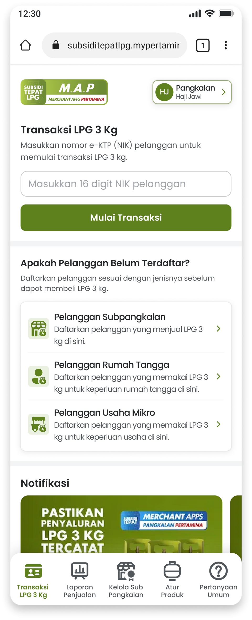
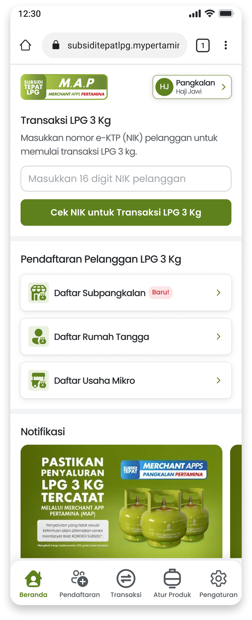
Added a label to make the Registration feature easier to identify. Made important menus, such as Seller Management and Transactions, more prominent. Moved the Transactions menu from the navigation bar to the main menu on the Home screen. Rewrote confusing wording and error messages to improve clarity.
B. PIN Activation
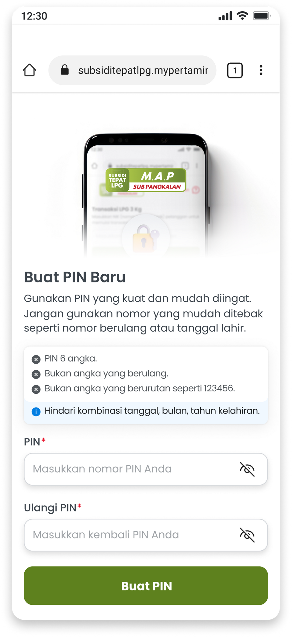
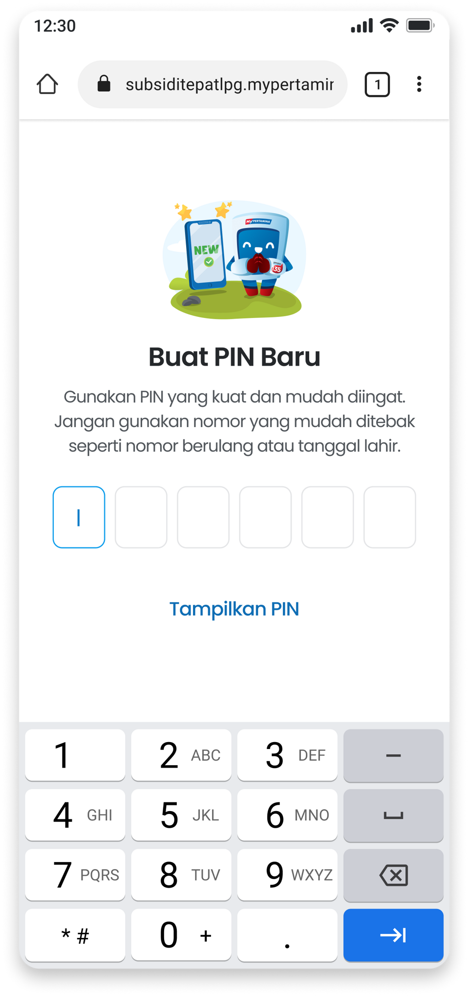
Simplified the PIN activation process to make it more intuitive and familiar to users, similar to entering a PIN at an ATM. Removed unnecessary wording and illustrations and replaced them with more relevant information.
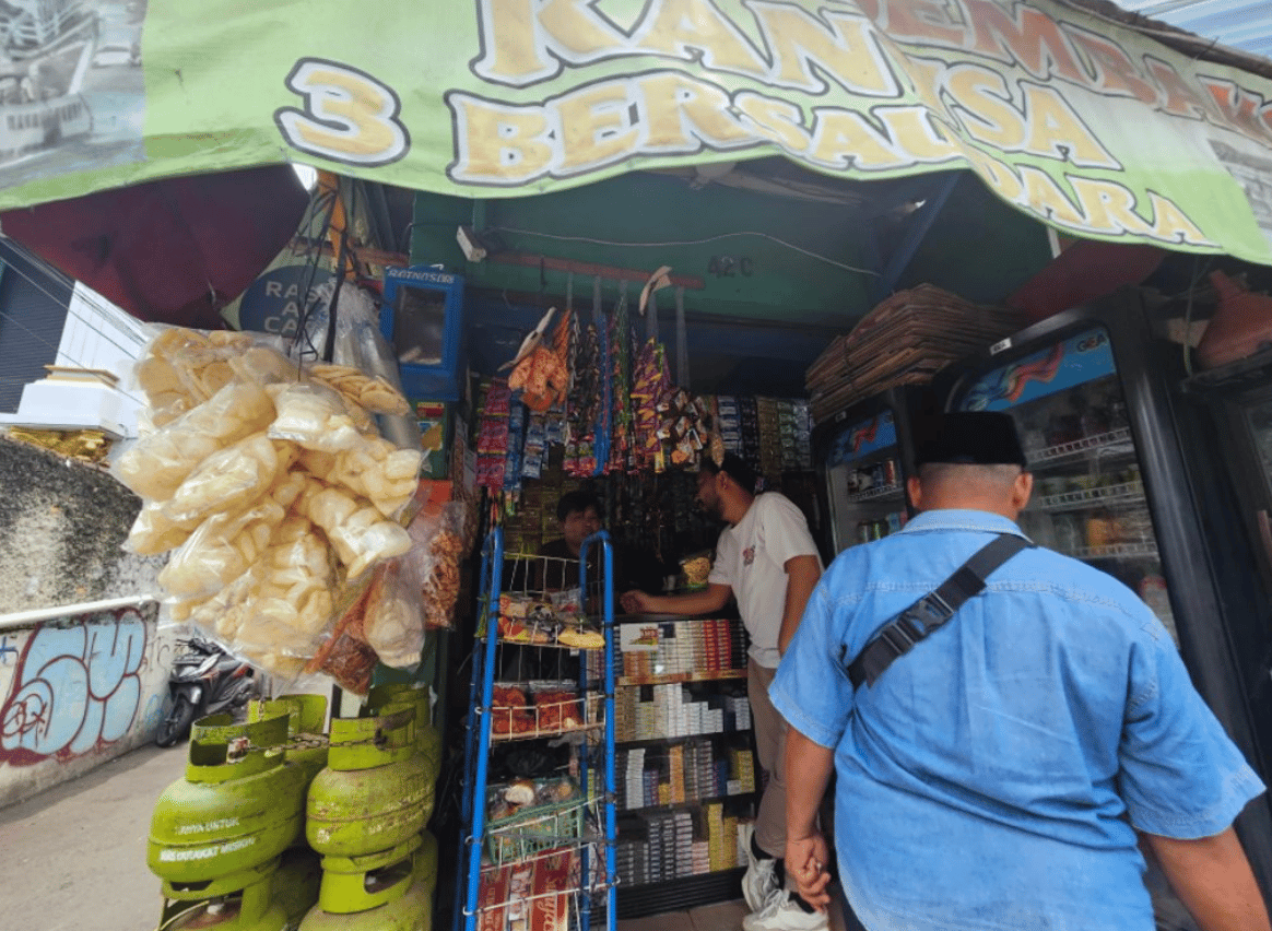
On-Site Research with Sellers
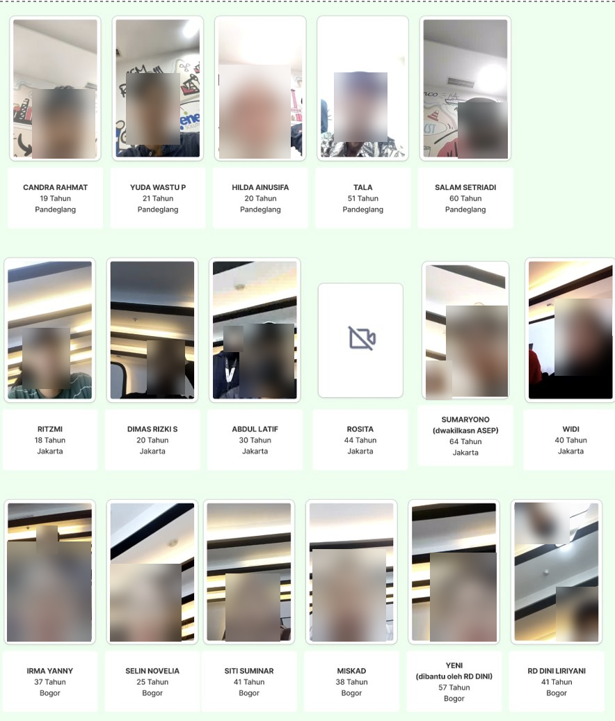
usability testing with sellers
Design solutions
Refined the pilot design based on usability testing results and stakeholder needs, applying design principles to improve the overall user experience and accessibility.

01
Labeling New Features
02
Prioritizing Important Menus
03
Clearer Wording and Relevant Illustrations
01
Aligning with Real-World Experiences
ACHIEVEMENT
Delivered the project within the planned 1-month timeline.
Achieved 99.5% of the project KPI target.
What i learned
- Stakeholder Alignment: Stakeholder expectations do not always align, so we need to find a way to accommodate both needs.
- Digitalization Has Its Limitations: Digitalization is not always the best or most feasible solution for every situation.
- Accessibility Requires Testing: Accessibility can be tricky to get right and needs to be tested with real users.


Back to Work
Merchant Apps Pertamina
Client
Pertamina Patra Niaga
Year
2025
Platform
Web-Based, Dashboard
Role
UX Designer
Scale
Enterprise-Government
Tools
Figma, Miro, Notion
Merchant Apps Pertamina supports the distribution of subsidized 3 kg LPG cylinders in Indonesia. As the UX designer, I tested seller workflows and redesigned parts of the transaction experience. Our team delivered the project in one month and reached 99.5% of the project KPI target.
The platform aims to ensure that subsidies reach their intended beneficiaries through targeted distribution, greater transparency, and real-time data-driven monitoring.
Overview
In this use case, the focus is on how Merchant Apps Pertamina improves the usability of transactions between sellers and buyers of 3 kg LPG cylinders. The application is designed for use across Indonesia, including the country's 3T regions (tertinggal, terdepan, dan terluar), which refer to underdeveloped, frontier, and outermost areas that may face challenges in infrastructure, connectivity, and access to digital services. This diverse context requires an inclusive and accessible design that accommodates people from different backgrounds, levels of digital literacy, and degrees of familiarity with technology.
To understand the sentiment of the intended users, we conducted quick research to assess their opinions and readiness for the project before its wider roll-out. The findings revealed a significant gap between stakeholder expectations and real-world conditions, which could hinder user adoption and the successful implementation of the project.
the problem
- Technical and Usability BarriersMany sellers are reluctant to use the application due to technical challenges, including unreliable internet connectivity, limited digital literacy, and incompatible or low-specification smartphones. As a result, they prefer to record transactions manually.
- Limited Time & Stakeholder ExpectationsLimited time to design the application based on stakeholder requirements.
Goals
- To make the web app experience smoother and reduce technical issues and usability barriers that could prevent users from adopting the platform.
- To prevent broken user journeys and ensure that users can complete key tasks smoothly in real-world conditions.
- Ensuring that stakeholder requirements are fulfilled within the expected timeline.
My role
Conducted usability testing, identified user pain points, analyzed root causes, and designed UX improvements to address the identified issues.
Process

01
Research
The project started with preliminary research involving seven sellers of 3 kg LPG cylinders. The findings revealed the initial problems outlined above.
02
Brainstorming
The design team, project managers, and stakeholders collaborated to discuss the initial problems and generate potential solutions for implementation.
03
Pilot Design
The design team created the first version (v1) of the application to evaluate how well it supported users in real-world conditions before the full-scale rollout.
04
Usability Testing
The pilot design was tested with 32 participants aged 18–60 to capture diverse user perspectives and identify usability issues in the initial design.
05
Design Improvement
Based on the usability testing results, the design team refined the design to address identified usability issues and improve the experience based on users' difficulties during testing.
06
Rollout and Monitoring
The improved design was implemented. During the rollout, the design team monitored the application, maintained the quality, and gathered feedback to further improvement.
Research
A. Objective
To simplify the transaction process for 3 kg LPG cylinders by transitioning to a fully digital system.
B. Method
In-depth interviews and shadowing to identify and assess sellers' behaviors, motivations, pain points when using digital transaction systems, and levels of digital adoption.
C. Respondent Profile
Age: 35–50 years old Stock in shop: 10–20 LPG cylinders Digital literacy: Have a smartphone and are familiar with digital applications Device access: Do not own a smartphone
D. Findings
Eager to adopt digitalization, recognize its urgency, and understand its benefits for ensuring the proper distribution of LPG to the intended recipients.
Open to change but need time to adapt, preferring to wait for tangible results before fully embracing digitalization.
Resist change because they perceive it as an additional burden, require training, and prefer the manual system.
Seller #1
Seller #5
Seller #2
Need guidance, believe the manual system is sufficient, and remain skeptical about the effectiveness of digitalization.
Seller #6
Seller #3
Seller #7
Seller #4
Many sellers are reluctant to use the application due to technical challenges, including unreliable internet connectivity, limited digital literacy, and incompatible or low-specification smartphones. As a result, they prefer to record transactions manually. Sellers tend to prefer cash payments over digital transactions because they perceive cash as more reliable and trustworthy. Sellers often rely on their relatives for guidance and assistance in learning how to use the digital application.
Usability Testing
A. Objective
To gather insights and feedback from prospective users on the pilot design. To identify usability issues and improve the user experience to ensure the application accommodates users with diverse needs and levels of digital literacy.
B. What to Validate
Registration Feature: 100% success rate, with task completion in under 4 minutes. PIN Activation: 100% success rate, with task completion in under 2 minutes. Seller Management: 100% success rate, with task completion in under 5 minutes. Transaction Feature: 100% success rate, with task completion in under 6 minutes.
C. Respondent Profile
Age: 18–60 years old Own a smartphone capable of running the application Have experience as LPG sellers
D. Result
Registration Feature: Success Rate: 73.33% Task Completion Time: 12 minutes Key Issue: Sellers confused the Transaction feature with the Registration feature.
PIN Activation: Success Rate: 60% Task Completion Time: 8 minutes Key Issue: The error message was confusing, and sellers overlooked the on-screen instructions.
Seller Management: Success Rate: 82.35% Task Completion Time: 1.5 minutes Key Issue: Navigation issues prevented sellers from finding the menu.
Transaction Feature: Success Rate: 35.29% Task Completion Time: 8 minutes Key Issue: Sellers struggled to understand how the feature worked.
Design Improvement
A. Registration, Seller Management, and Transaction Features
Added a label to make the Registration feature easier to identify. Made important menus, such as Seller Management and Transactions, more prominent. Moved the Transactions menu from the navigation bar to the main menu on the Home screen. Rewrote confusing wording and error messages to improve clarity.
B. PIN Activation
Simplified the PIN activation process to make it more intuitive and familiar to users, similar to entering a PIN at an ATM. Removed unnecessary wording and illustrations and replaced them with more relevant information.
On-Site Research with Sellers
usability testing with sellers
Design solutions
Refined the pilot design based on usability testing results and stakeholder needs, applying design principles to improve the overall user experience and accessibility.

01
Labeling New Features
Added a label to make the registration feature easier to identify.
02
Prioritizing Important Menus
Made essential menus, such as Seller Management and Transactions, more prominent by moving it from the navigation bar to the main menu on the Home screen.
03
Clearer Wording and Relevant Illustrations
Removed unnecessary wording and illustrations and replaced them with more relevant information.
01
Aligning with Real-World Experiences
Redesigned the PIN activation field to make it more intuitive and familiar to users, similar to entering a PIN at an ATM.
ACHIEVEMENT
Delivered the project within the planned 1-month timeline.
Achieved 99.5% of the project KPI target.
What i learned
- Stakeholder Alignment: Stakeholder expectations do not always align, so we need to find a way to accommodate both needs.
- Digitalization Has Its Limitations: Digitalization is not always the best or most feasible solution for every situation.
- Accessibility Requires Testing: Accessibility can be tricky to get right and needs to be tested with real users.
Back to Work
Merchant Apps Pertamina
Client
Pertamina Patra Niaga
Year
2025
Platform
Web-Based, Dashboard
Role
UX Designer
Scale
Enterprise-Government
Tools
Figma, Miro, Notion
Merchant Apps Pertamina supports the distribution of subsidized 3 kg LPG cylinders in Indonesia. As the UX designer, I tested seller workflows and redesigned parts of the transaction experience. Our team delivered the project in one month and reached 99.5% of the project KPI target.
The platform aims to ensure that subsidies reach their intended beneficiaries through targeted distribution, greater transparency, and real-time data-driven monitoring.
Overview
In this use case, the focus is on how Merchant Apps Pertamina improves the usability of transactions between sellers and buyers of 3 kg LPG cylinders. The application is designed for use across Indonesia, including the country's 3T regions (tertinggal, terdepan, dan terluar), which refer to underdeveloped, frontier, and outermost areas that may face challenges in infrastructure, connectivity, and access to digital services. This diverse context requires an inclusive and accessible design that accommodates people from different backgrounds, levels of digital literacy, and degrees of familiarity with technology.
To understand the sentiment of the intended users, we conducted quick research to assess their opinions and readiness for the project before its wider roll-out. The findings revealed a significant gap between stakeholder expectations and real-world conditions, which could hinder user adoption and the successful implementation of the project.
the problem
- Technical and Usability BarriersMany sellers are reluctant to use the application due to technical challenges, including unreliable internet connectivity, limited digital literacy, and incompatible or low-specification smartphones. As a result, they prefer to record transactions manually.
- Limited Time & Stakeholder ExpectationsLimited time to design the application based on stakeholder requirements.
Goals
- To make the web app experience smoother and reduce technical issues and usability barriers that could prevent users from adopting the platform.
- To prevent broken user journeys and ensure that users can complete key tasks smoothly in real-world conditions.
- Ensuring that stakeholder requirements are fulfilled within the expected timeline.
My role
Conducted usability testing, identified user pain points, analyzed root causes, and designed UX improvements to address the identified issues.
Process

01
Research
The project started with preliminary research involving seven sellers of 3 kg LPG cylinders. The findings revealed the initial problems outlined above.
02
Brainstorming
The design team, project managers, and stakeholders collaborated to discuss the initial problems and generate potential solutions for implementation.
03
Pilot Design
The design team created the first version (v1) of the application to evaluate how well it supported users in real-world conditions before the full-scale rollout.
04
Usability Testing
The pilot design was tested with 32 participants aged 18–60 to capture diverse user perspectives and identify usability issues in the initial design.
05
Design Improvement
Based on the usability testing results, the design team refined the design to address identified usability issues and improve the experience based on users' difficulties during testing.
06
Rollout and Monitoring
The improved design was implemented. During the rollout, the design team monitored the application, maintained the quality, and gathered feedback to further improvement.
Research
A. Objective
To simplify the transaction process for 3 kg LPG cylinders by transitioning to a fully digital system.
B. Method
In-depth interviews and shadowing to identify and assess sellers' behaviors, motivations, pain points when using digital transaction systems, and levels of digital adoption.
C. Respondent Profile
Age: 35–50 years old Stock in shop: 10–20 LPG cylinders Digital literacy: Have a smartphone and are familiar with digital applications Device access: Do not own a smartphone
D. Findings
Eager to adopt digitalization, recognize its urgency, and understand its benefits for ensuring the proper distribution of LPG to the intended recipients.
Open to change but need time to adapt, preferring to wait for tangible results before fully embracing digitalization.
Resist change because they perceive it as an additional burden, require training, and prefer the manual system.
Seller #1
Seller #5
Seller #2
Need guidance, believe the manual system is sufficient, and remain skeptical about the effectiveness of digitalization.
Seller #6
Seller #3
Seller #7
Seller #4
Many sellers are reluctant to use the application due to technical challenges, including unreliable internet connectivity, limited digital literacy, and incompatible or low-specification smartphones. As a result, they prefer to record transactions manually. Sellers tend to prefer cash payments over digital transactions because they perceive cash as more reliable and trustworthy. Sellers often rely on their relatives for guidance and assistance in learning how to use the digital application.
Usability Testing
A. Objective
To gather insights and feedback from prospective users on the pilot design. To identify usability issues and improve the user experience to ensure the application accommodates users with diverse needs and levels of digital literacy.
B. What to Validate
Registration Feature: 100% success rate, with task completion in under 4 minutes. PIN Activation: 100% success rate, with task completion in under 2 minutes. Seller Management: 100% success rate, with task completion in under 5 minutes. Transaction Feature: 100% success rate, with task completion in under 6 minutes.
C. Respondent Profile
Age: 18–60 years old Own a smartphone capable of running the application Have experience as LPG sellers
D. Result
Registration Feature: Success Rate: 73.33% Task Completion Time: 12 minutes Key Issue: Sellers confused the Transaction feature with the Registration feature.
PIN Activation: Success Rate: 60% Task Completion Time: 8 minutes Key Issue: The error message was confusing, and sellers overlooked the on-screen instructions.
Seller Management: Success Rate: 82.35% Task Completion Time: 1.5 minutes Key Issue: Navigation issues prevented sellers from finding the menu.
Transaction Feature: Success Rate: 35.29% Task Completion Time: 8 minutes Key Issue: Sellers struggled to understand how the feature worked.
Design Improvement
A. Registration, Seller Management, and Transaction Features
Added a label to make the Registration feature easier to identify. Made important menus, such as Seller Management and Transactions, more prominent. Moved the Transactions menu from the navigation bar to the main menu on the Home screen. Rewrote confusing wording and error messages to improve clarity.
B. PIN Activation
Simplified the PIN activation process to make it more intuitive and familiar to users, similar to entering a PIN at an ATM. Removed unnecessary wording and illustrations and replaced them with more relevant information.
On-Site Research with Sellers
usability testing with sellers
Design solutions
Refined the pilot design based on usability testing results and stakeholder needs, applying design principles to improve the overall user experience and accessibility.

01
Labeling New Features
Added a label to make the registration feature easier to identify.
02
Prioritizing Important Menus
Made essential menus, such as Seller Management and Transactions, more prominent by moving it from the navigation bar to the main menu on the Home screen.
03
Clearer Wording and Relevant Illustrations
Removed unnecessary wording and illustrations and replaced them with more relevant information.
01
Aligning with Real-World Experiences
Redesigned the PIN activation field to make it more intuitive and familiar to users, similar to entering a PIN at an ATM.
ACHIEVEMENT
Delivered the project within the planned 1-month timeline.
Achieved 99.5% of the project KPI target.
What i learned
- Stakeholder Alignment: Stakeholder expectations do not always align, so we need to find a way to accommodate both needs.
- Digitalization Has Its Limitations: Digitalization is not always the best or most feasible solution for every situation.
- Accessibility Requires Testing: Accessibility can be tricky to get right and needs to be tested with real users.
Back to Work
Merchant Apps Pertamina
Client
Pertamina Patra Niaga
Year
2025
Platform
Web-Based, Dashboard
Role
UX Designer
Scale
Enterprise-Government
Tools
Figma, Miro, Notion
Merchant Apps Pertamina supports the distribution of subsidized 3 kg LPG cylinders in Indonesia. As the UX designer, I tested seller workflows and redesigned parts of the transaction experience. Our team delivered the project in one month and reached 99.5% of the project KPI target.
The platform aims to ensure that subsidies reach their intended beneficiaries through targeted distribution, greater transparency, and real-time data-driven monitoring.
Overview
In this use case, the focus is on how Merchant Apps Pertamina improves the usability of transactions between sellers and buyers of 3 kg LPG cylinders. The application is designed for use across Indonesia, including the country's 3T regions (tertinggal, terdepan, dan terluar), which refer to underdeveloped, frontier, and outermost areas that may face challenges in infrastructure, connectivity, and access to digital services. This diverse context requires an inclusive and accessible design that accommodates people from different backgrounds, levels of digital literacy, and degrees of familiarity with technology.
To understand the sentiment of the intended users, we conducted quick research to assess their opinions and readiness for the project before its wider roll-out. The findings revealed a significant gap between stakeholder expectations and real-world conditions, which could hinder user adoption and the successful implementation of the project.
the problem
- Technical and Usability BarriersMany sellers are reluctant to use the application due to technical challenges, including unreliable internet connectivity, limited digital literacy, and incompatible or low-specification smartphones. As a result, they prefer to record transactions manually.
- Limited Time & Stakeholder ExpectationsLimited time to design the application based on stakeholder requirements.
Goals
- To make the web app experience smoother and reduce technical issues and usability barriers that could prevent users from adopting the platform.
- To prevent broken user journeys and ensure that users can complete key tasks smoothly in real-world conditions.
- Ensuring that stakeholder requirements are fulfilled within the expected timeline.
My role
Conducted usability testing, identified user pain points, analyzed root causes, and designed UX improvements to address the identified issues.
Process

01
Research
The project started with preliminary research involving seven sellers of 3 kg LPG cylinders. The findings revealed the initial problems outlined above.
02
Brainstorming
The design team, project managers, and stakeholders collaborated to discuss the initial problems and generate potential solutions for implementation.
03
Pilot Design
The design team created the first version (v1) of the application to evaluate how well it supported users in real-world conditions before the full-scale rollout.
04
Usability Testing
The pilot design was tested with 32 participants aged 18–60 to capture diverse user perspectives and identify usability issues in the initial design.
05
Design Improvement
Based on the usability testing results, the design team refined the design to address identified usability issues and improve the experience based on users' difficulties during testing.
06
Rollout and Monitoring
The improved design was implemented. During the rollout, the design team monitored the application, maintained the quality, and gathered feedback to further improvement.
Research
A. Objective
To simplify the transaction process for 3 kg LPG cylinders by transitioning to a fully digital system.
B. Method
In-depth interviews and shadowing to identify and assess sellers' behaviors, motivations, pain points when using digital transaction systems, and levels of digital adoption.
C. Respondent Profile
Age: 35–50 years old Stock in shop: 10–20 LPG cylinders Digital literacy: Have a smartphone and are familiar with digital applications Device access: Do not own a smartphone
D. Findings
Eager to adopt digitalization, recognize its urgency, and understand its benefits for ensuring the proper distribution of LPG to the intended recipients.
Open to change but need time to adapt, preferring to wait for tangible results before fully embracing digitalization.
Resist change because they perceive it as an additional burden, require training, and prefer the manual system.
Seller #1
Seller #5
Seller #2
Need guidance, believe the manual system is sufficient, and remain skeptical about the effectiveness of digitalization.
Seller #6
Seller #3
Seller #7
Seller #4
Many sellers are reluctant to use the application due to technical challenges, including unreliable internet connectivity, limited digital literacy, and incompatible or low-specification smartphones. As a result, they prefer to record transactions manually. Sellers tend to prefer cash payments over digital transactions because they perceive cash as more reliable and trustworthy. Sellers often rely on their relatives for guidance and assistance in learning how to use the digital application.
Usability Testing
A. Objective
To gather insights and feedback from prospective users on the pilot design. To identify usability issues and improve the user experience to ensure the application accommodates users with diverse needs and levels of digital literacy.
B. What to Validate
Registration Feature: 100% success rate, with task completion in under 4 minutes. PIN Activation: 100% success rate, with task completion in under 2 minutes. Seller Management: 100% success rate, with task completion in under 5 minutes. Transaction Feature: 100% success rate, with task completion in under 6 minutes.
C. Respondent Profile
Age: 18–60 years old Own a smartphone capable of running the application Have experience as LPG sellers
D. Result
Registration Feature: Success Rate: 73.33% Task Completion Time: 12 minutes Key Issue: Sellers confused the Transaction feature with the Registration feature.
PIN Activation: Success Rate: 60% Task Completion Time: 8 minutes Key Issue: The error message was confusing, and sellers overlooked the on-screen instructions.
Seller Management: Success Rate: 82.35% Task Completion Time: 1.5 minutes Key Issue: Navigation issues prevented sellers from finding the menu.
Transaction Feature: Success Rate: 35.29% Task Completion Time: 8 minutes Key Issue: Sellers struggled to understand how the feature worked.
Design Improvement
A. Registration, Seller Management, and Transaction Features
Added a label to make the Registration feature easier to identify. Made important menus, such as Seller Management and Transactions, more prominent. Moved the Transactions menu from the navigation bar to the main menu on the Home screen. Rewrote confusing wording and error messages to improve clarity.
B. PIN Activation
Simplified the PIN activation process to make it more intuitive and familiar to users, similar to entering a PIN at an ATM. Removed unnecessary wording and illustrations and replaced them with more relevant information.
On-Site Research with Sellers
usability testing with sellers
Design solutions
Refined the pilot design based on usability testing results and stakeholder needs, applying design principles to improve the overall user experience and accessibility.
01
Labeling New Features
Added a label to make the registration feature easier to identify.
02
Prioritizing Important Menus
Made essential menus, such as Seller Management and Transactions, more prominent by moving it from the navigation bar to the main menu on the Home screen.
03
Clearer Wording and Relevant Illustrations
Removed unnecessary wording and illustrations and replaced them with more relevant information.
01
Aligning with Real-World Experiences
Redesigned the PIN activation field to make it more intuitive and familiar to users, similar to entering a PIN at an ATM.
ACHIEVEMENT
Delivered the project within the planned 1-month timeline.
Achieved 99.5% of the project KPI target.
What i learned
- Stakeholder Alignment: Stakeholder expectations do not always align, so we need to find a way to accommodate both needs.
- Digitalization Has Its Limitations: Digitalization is not always the best or most feasible solution for every situation.
- Accessibility Requires Testing: Accessibility can be tricky to get right and needs to be tested with real users.