


Back to Work
Antares Eazy
Client
Telkom Indonesia
Year
2024
Platform
Native App, e-Commerce Website, Dashboard
Role
UI/UX Designer
Scale
Enterprise
Tools
Figma, Miro, Notion
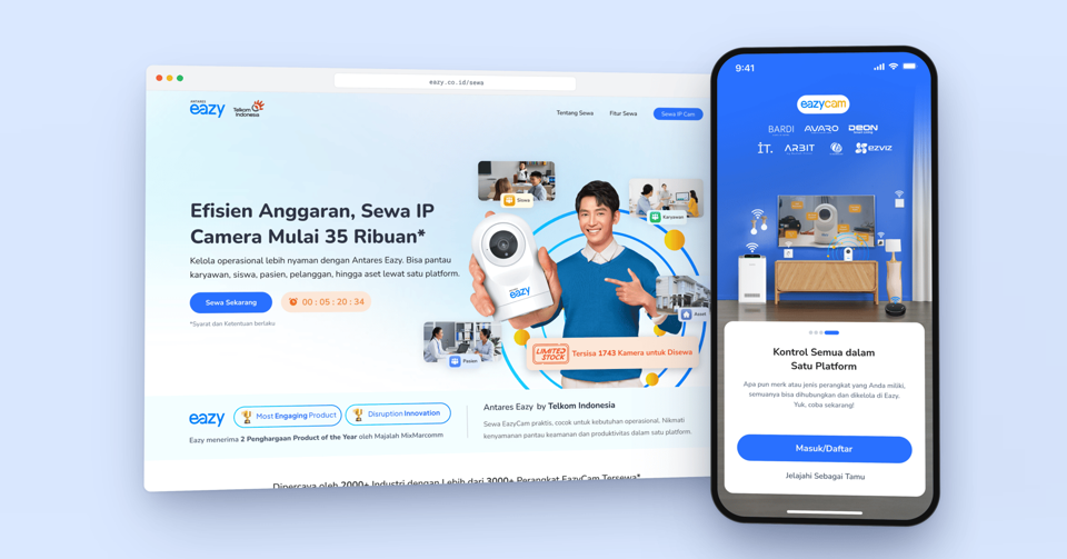
Antares Eazy is Telkom Indonesia’s smart home app. I redesigned its checkout so people could choose installation and cloud recording during a device purchase. The project reported that 30% of device buyers also purchased add-on services.
With scheduling, cloud recording, real-time alerts, and family sharing, it keeps homes secure while saving time, energy, and money.
Overview
In 2024, Antares Eazy was used by 20,000+ users across Indonesia to manage and purchase IoT devices for their homes, offices, schools, and other environments. To grow the business and increase revenue, a new feature was planned to let users purchase cloud recording and installation services. This addressed user feedback about the difficulties of installing unfamiliar IoT devices.
the problem
- Low E-Commerce EngagementFew users engaged with the e-commerce section of Antares Eazy, as most used the app primarily to manage their existing devices. This limited opportunities to drive additional purchases through the platform.
- Overwhelming Checkout ExperienceAdding cloud recording and installation services to the existing purchase journey could make the checkout experience overwhelming. Without a clear structure, users might struggle to understand the available options and hesitate to proceed with their transactions.
Goals
- To make the web app experience smoother and reduce technical issues which could prevent users from adopting the platform.
- To prevent broken user journeys and ensure that users can complete key tasks smoothly in real-world conditions.
- To fulfill stakeholder requirements within the expected timeline.
My role
Analyzed the problems, designed the user flow, checkout structure, wireframes, and high-fidelity UI, briefed the UX writer, and coordinated with the PM, design, and development teams to deliver the expected results.
Process

01
Brainstorming
Discussed the proposed ideas with the PM and design team to evaluate their feasibility.
02
Design Improvement
Redesigned the existing checkout experience, developed the user flow and high-fidelity UI, and briefed the UX writer.
03
Stakeholder Discussion
Presented the new design to stakeholders for review to ensure alignment with business requirements.
04
Rollout and Monitoring
The improved design was implemented. During the rollout, the design team monitored the application, maintained the quality, and gathered feedback to further improvement.
Brainstorming
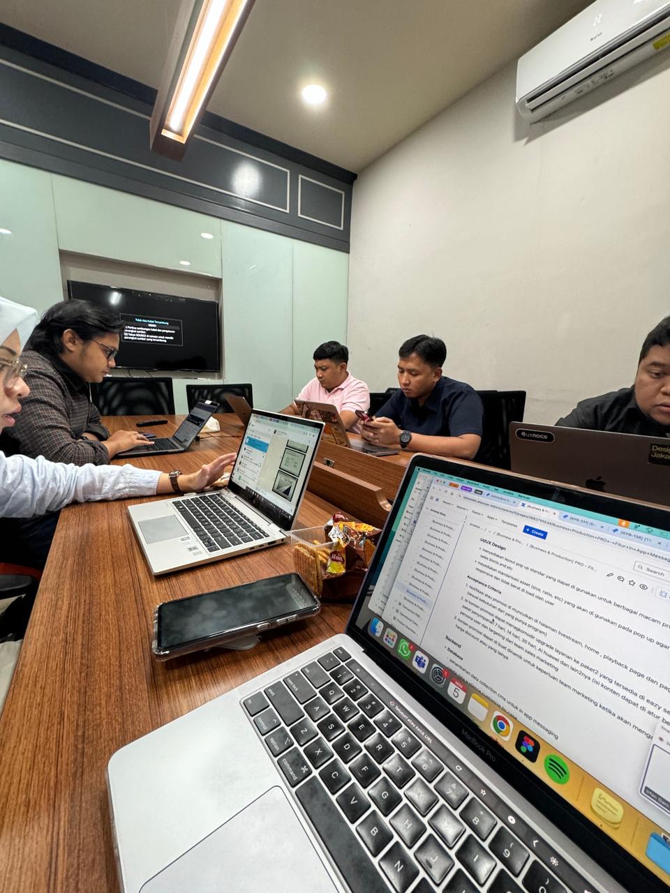
Discussed the proposed ideas with the PM and design team to evaluate their feasibility.
Design Improvement
A. Previous Design
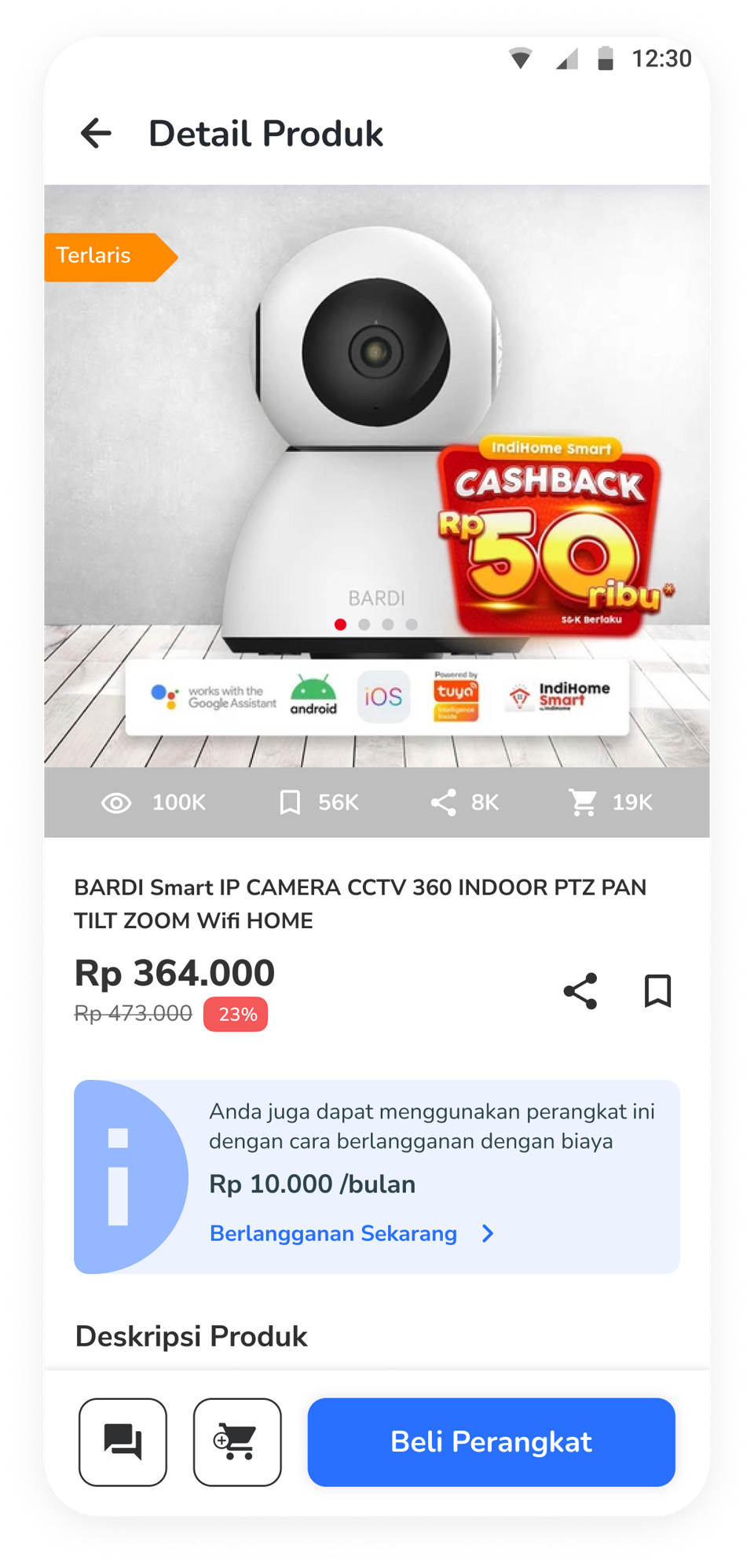
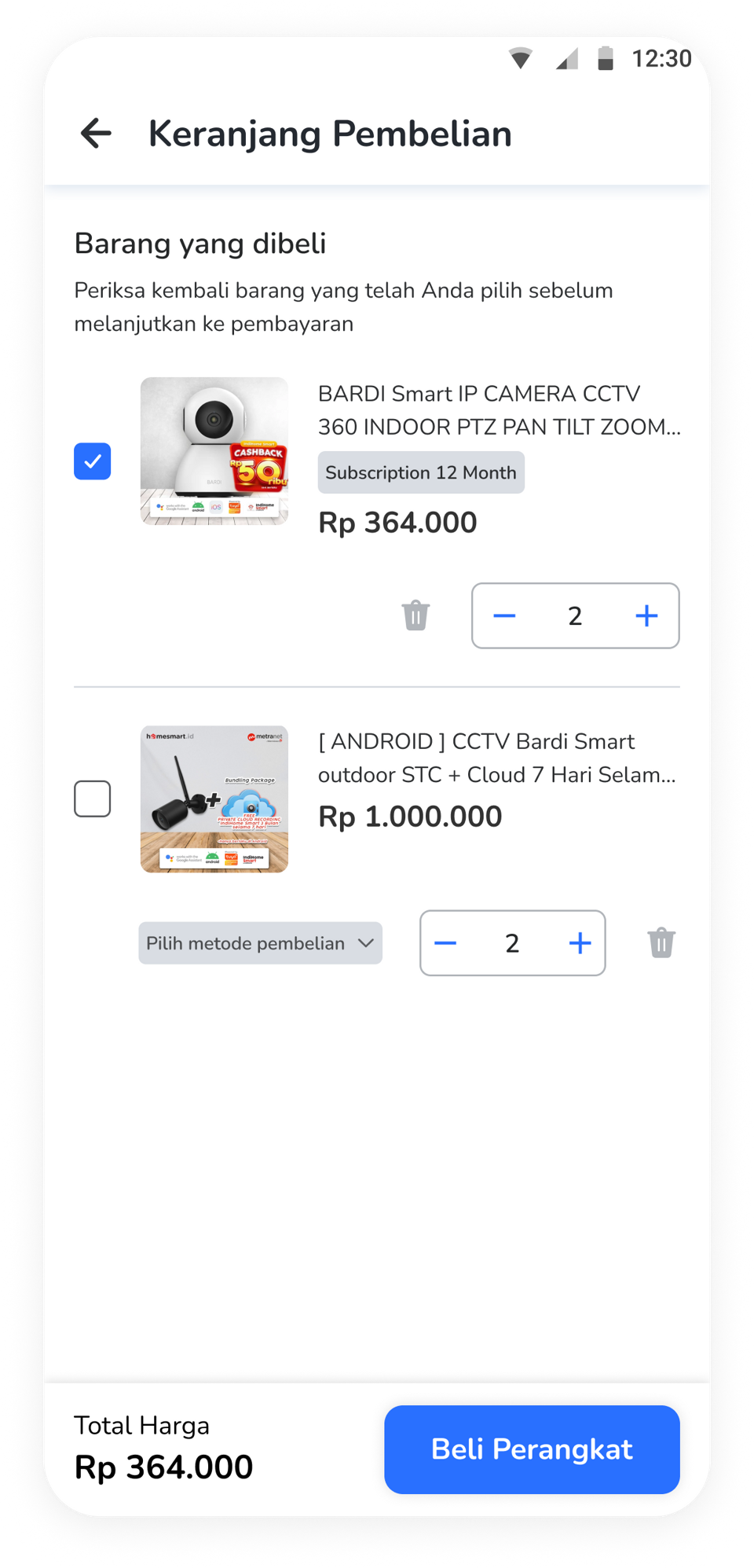
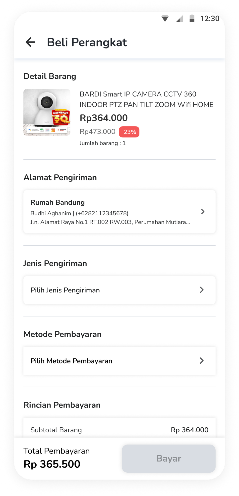
The existing design before the introduction of the add-on options.
B. User Flow Draft
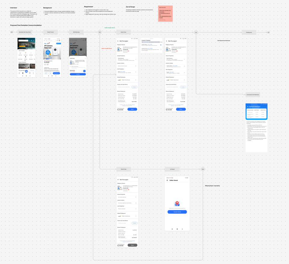
Drafted the user flow and discussed it with the design team to evaluate its feasibility and alignment with the project requirements.
C. Briefing the UX Writer
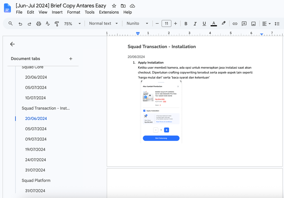
Explained the design and provided context to help the UX writer develop clearer copy that would inform potential buyers about the new add-on services and improve their understanding of the features.
D. Final Design
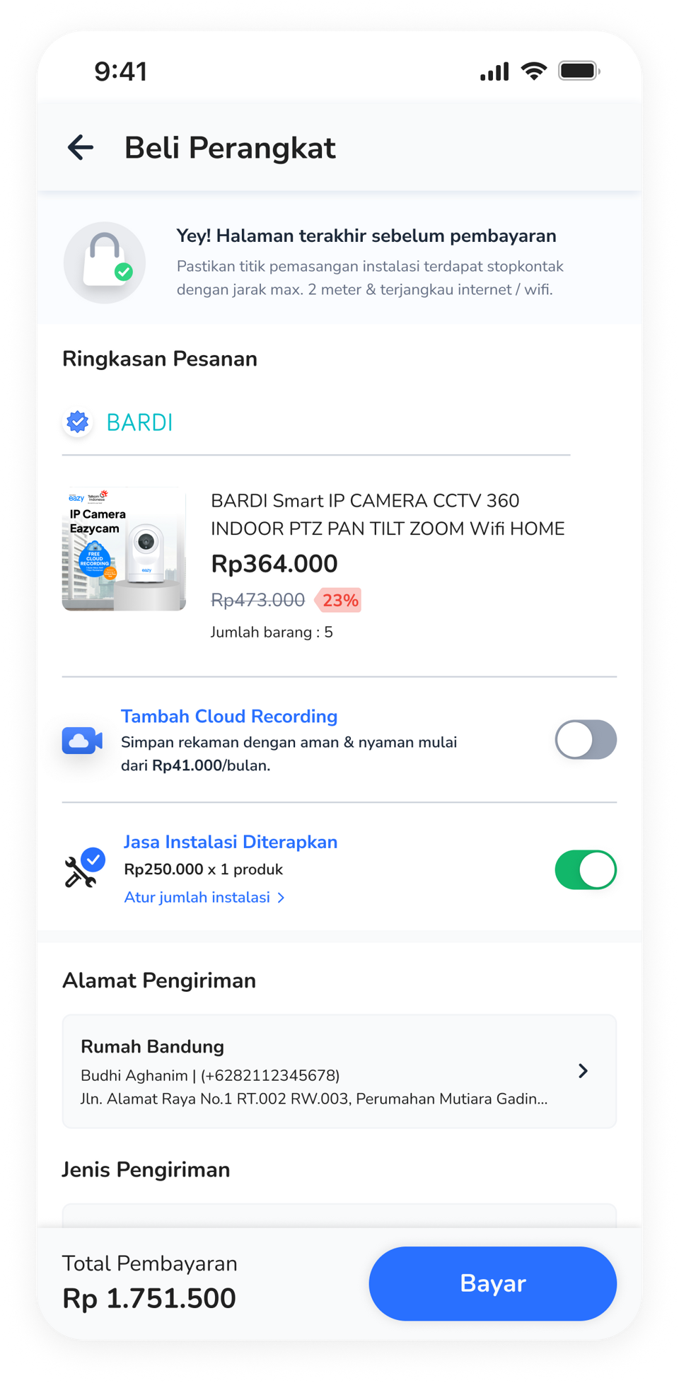
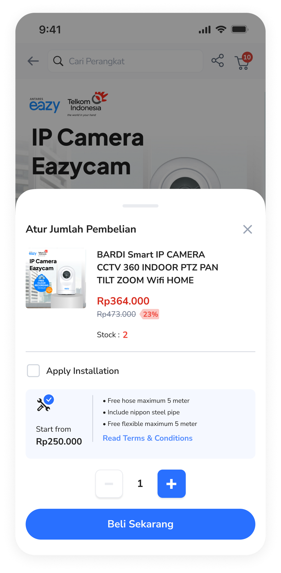
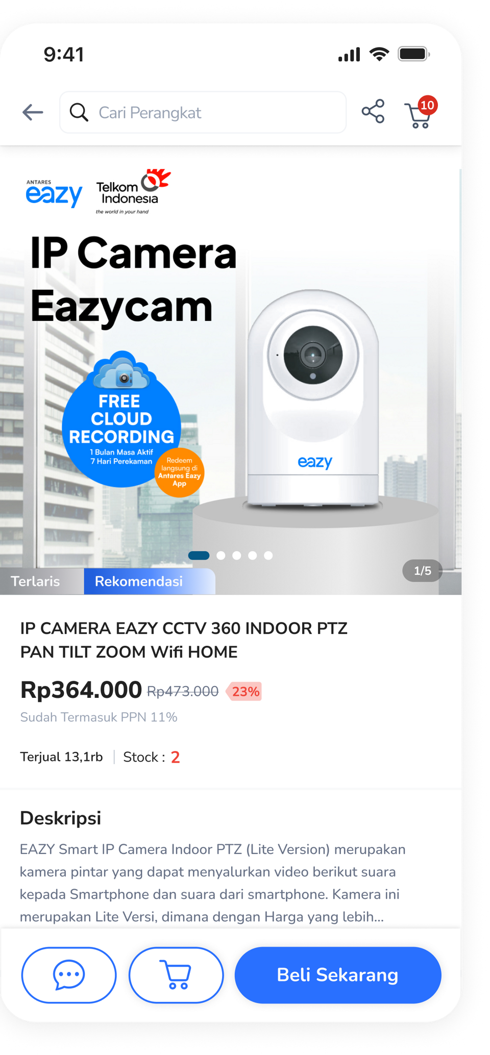
Finalized the design in collaboration with the design and development teams, incorporating the following improvements: Improved the banner illustrations. Refined icons and buttons to make key actions more prominent. Removed unnecessary banners with low click-through rates. Added an installation add-on pop-up after users clicked the checkout button to avoid overwhelming them with options. Placed the cloud recording add-on on the checkout details page.
D. Final User Flow
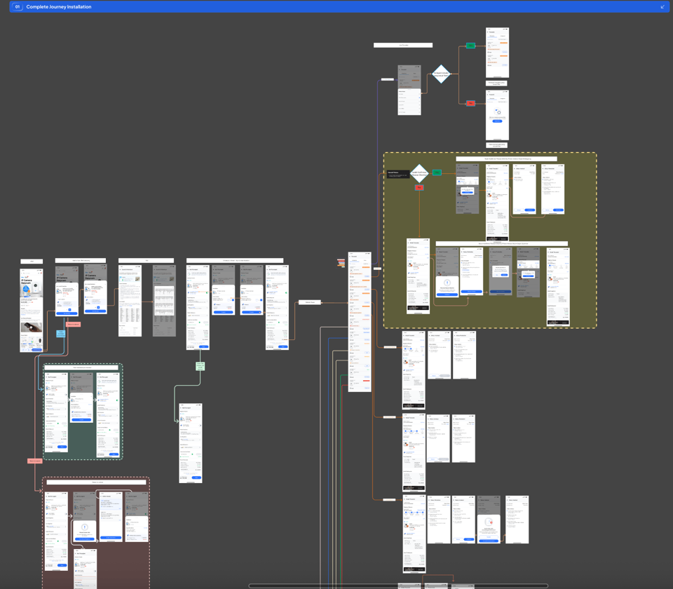
Presented the complete user flow for the new add-on features.
Stakeholder Discussion
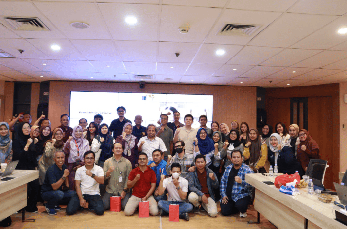
Presented the new design to stakeholders for review to ensure alignment with business requirements.
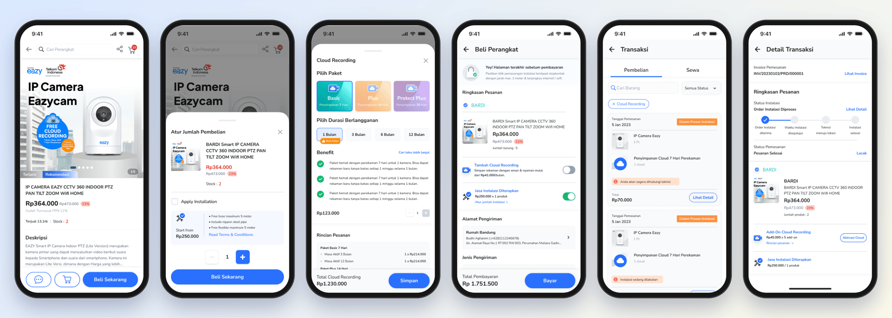
the final design
Design solutions

01
Prioritize Installation Services
02
Simplify the Add-On Journey
03
Improve Product Understanding
ACHIEVEMENT
Increase in engagement. Users spent more time on the page and click activity increased.
Increase in CCTV Sales. CCTV sales increased following the design improvements.
Add-On Adoption Rate. 30% of users who purchased a device also purchased the add-on services.
What i learned
- Introducing New Feature: Stakeholder expectations do not always align, so we need to find ways to accommodate different needs while maintaining a cohesive user experience.
- Balancing Business and User Experience: Business goals and user needs must be balanced to ensure that new features create value for both the business and its users.


Back to Work
Antares Eazy
Client
Telkom Indonesia
Year
2024
Platform
Native App, e-Commerce Website, Dashboard
Role
UI/UX Designer
Scale
Enterprise
Tools
Figma, Miro, Notion
Antares Eazy is Telkom Indonesia’s smart home app. I redesigned its checkout so people could choose installation and cloud recording during a device purchase. The project reported that 30% of device buyers also purchased add-on services.
With scheduling, cloud recording, real-time alerts, and family sharing, it keeps homes secure while saving time, energy, and money.
Overview
In 2024, Antares Eazy was used by 20,000+ users across Indonesia to manage and purchase IoT devices for their homes, offices, schools, and other environments. To grow the business and increase revenue, a new feature was planned to let users purchase cloud recording and installation services. This addressed user feedback about the difficulties of installing unfamiliar IoT devices.
the problem
- Low E-Commerce EngagementFew users engaged with the e-commerce section of Antares Eazy, as most used the app primarily to manage their existing devices. This limited opportunities to drive additional purchases through the platform.
- Overwhelming Checkout ExperienceAdding cloud recording and installation services to the existing purchase journey could make the checkout experience overwhelming. Without a clear structure, users might struggle to understand the available options and hesitate to proceed with their transactions.
Goals
- To make the web app experience smoother and reduce technical issues which could prevent users from adopting the platform.
- To prevent broken user journeys and ensure that users can complete key tasks smoothly in real-world conditions.
- To fulfill stakeholder requirements within the expected timeline.
My role
Analyzed the problems, designed the user flow, checkout structure, wireframes, and high-fidelity UI, briefed the UX writer, and coordinated with the PM, design, and development teams to deliver the expected results.
Process

01
Brainstorming
Discussed the proposed ideas with the PM and design team to evaluate their feasibility.
02
Design Improvement
Redesigned the existing checkout experience, developed the user flow and high-fidelity UI, and briefed the UX writer.
03
Stakeholder Discussion
Presented the new design to stakeholders for review to ensure alignment with business requirements.
04
Rollout and Monitoring
The improved design was implemented. During the rollout, the design team monitored the application, maintained the quality, and gathered feedback to further improvement.
Brainstorming
Discussed the proposed ideas with the PM and design team to evaluate their feasibility.
Design Improvement
A. Previous Design
The existing design before the introduction of the add-on options.
B. User Flow Draft
Drafted the user flow and discussed it with the design team to evaluate its feasibility and alignment with the project requirements.
C. Briefing the UX Writer
Explained the design and provided context to help the UX writer develop clearer copy that would inform potential buyers about the new add-on services and improve their understanding of the features.
D. Final Design
Finalized the design in collaboration with the design and development teams, incorporating the following improvements: Improved the banner illustrations. Refined icons and buttons to make key actions more prominent. Removed unnecessary banners with low click-through rates. Added an installation add-on pop-up after users clicked the checkout button to avoid overwhelming them with options. Placed the cloud recording add-on on the checkout details page.
D. Final User Flow
Presented the complete user flow for the new add-on features.
Stakeholder Discussion
Presented the new design to stakeholders for review to ensure alignment with business requirements.
the final design
Design solutions

01
Prioritize Installation Services
Based on business priorities and users' difficulties with installing unfamiliar devices, installation services were highlighted on the first checkout page. Cloud recording could be added later on the checkout details page.
02
Simplify the Add-On Journey
Separated installation and cloud recording into individual steps, with each option appearing in a pop-up when selected. This kept the checkout experience focused while allowing users to explore additional services when needed.
03
Improve Product Understanding
Introduced clearer product descriptions and supporting information for the new add-on services to help users understand their benefits before making a purchase.
ACHIEVEMENT
Increase in engagement. Users spent more time on the page and click activity increased.
Increase in CCTV Sales. CCTV sales increased following the design improvements.
Add-On Adoption Rate. 30% of users who purchased a device also purchased the add-on services.
What i learned
- Introducing New Feature: Stakeholder expectations do not always align, so we need to find ways to accommodate different needs while maintaining a cohesive user experience.
- Balancing Business and User Experience: Business goals and user needs must be balanced to ensure that new features create value for both the business and its users.
Back to Work
Antares Eazy
Client
Telkom Indonesia
Year
2024
Platform
Native App, e-Commerce Website, Dashboard
Role
UI/UX Designer
Scale
Enterprise
Tools
Figma, Miro, Notion
Antares Eazy is Telkom Indonesia’s smart home app. I redesigned its checkout so people could choose installation and cloud recording during a device purchase. The project reported that 30% of device buyers also purchased add-on services.
With scheduling, cloud recording, real-time alerts, and family sharing, it keeps homes secure while saving time, energy, and money.
Overview
In 2024, Antares Eazy was used by 20,000+ users across Indonesia to manage and purchase IoT devices for their homes, offices, schools, and other environments. To grow the business and increase revenue, a new feature was planned to let users purchase cloud recording and installation services. This addressed user feedback about the difficulties of installing unfamiliar IoT devices.
the problem
- Low E-Commerce EngagementFew users engaged with the e-commerce section of Antares Eazy, as most used the app primarily to manage their existing devices. This limited opportunities to drive additional purchases through the platform.
- Overwhelming Checkout ExperienceAdding cloud recording and installation services to the existing purchase journey could make the checkout experience overwhelming. Without a clear structure, users might struggle to understand the available options and hesitate to proceed with their transactions.
Goals
- To make the web app experience smoother and reduce technical issues which could prevent users from adopting the platform.
- To prevent broken user journeys and ensure that users can complete key tasks smoothly in real-world conditions.
- To fulfill stakeholder requirements within the expected timeline.
My role
Analyzed the problems, designed the user flow, checkout structure, wireframes, and high-fidelity UI, briefed the UX writer, and coordinated with the PM, design, and development teams to deliver the expected results.
Process

01
Brainstorming
Discussed the proposed ideas with the PM and design team to evaluate their feasibility.
02
Design Improvement
Redesigned the existing checkout experience, developed the user flow and high-fidelity UI, and briefed the UX writer.
03
Stakeholder Discussion
Presented the new design to stakeholders for review to ensure alignment with business requirements.
04
Rollout and Monitoring
The improved design was implemented. During the rollout, the design team monitored the application, maintained the quality, and gathered feedback to further improvement.
Brainstorming
Discussed the proposed ideas with the PM and design team to evaluate their feasibility.
Design Improvement
A. Previous Design
The existing design before the introduction of the add-on options.
B. User Flow Draft
Drafted the user flow and discussed it with the design team to evaluate its feasibility and alignment with the project requirements.
C. Briefing the UX Writer
Explained the design and provided context to help the UX writer develop clearer copy that would inform potential buyers about the new add-on services and improve their understanding of the features.
D. Final Design
Finalized the design in collaboration with the design and development teams, incorporating the following improvements: Improved the banner illustrations. Refined icons and buttons to make key actions more prominent. Removed unnecessary banners with low click-through rates. Added an installation add-on pop-up after users clicked the checkout button to avoid overwhelming them with options. Placed the cloud recording add-on on the checkout details page.
D. Final User Flow
Presented the complete user flow for the new add-on features.
Stakeholder Discussion
Presented the new design to stakeholders for review to ensure alignment with business requirements.
the final design
Design solutions

01
Prioritize Installation Services
Based on business priorities and users' difficulties with installing unfamiliar devices, installation services were highlighted on the first checkout page. Cloud recording could be added later on the checkout details page.
02
Simplify the Add-On Journey
Separated installation and cloud recording into individual steps, with each option appearing in a pop-up when selected. This kept the checkout experience focused while allowing users to explore additional services when needed.
03
Improve Product Understanding
Introduced clearer product descriptions and supporting information for the new add-on services to help users understand their benefits before making a purchase.
ACHIEVEMENT
Increase in engagement. Users spent more time on the page and click activity increased.
Increase in CCTV Sales. CCTV sales increased following the design improvements.
Add-On Adoption Rate. 30% of users who purchased a device also purchased the add-on services.
What i learned
- Introducing New Feature: Stakeholder expectations do not always align, so we need to find ways to accommodate different needs while maintaining a cohesive user experience.
- Balancing Business and User Experience: Business goals and user needs must be balanced to ensure that new features create value for both the business and its users.
Back to Work
Antares Eazy
Client
Telkom Indonesia
Year
2024
Platform
Native App, e-Commerce Website, Dashboard
Role
UI/UX Designer
Scale
Enterprise
Tools
Figma, Miro, Notion
Antares Eazy is Telkom Indonesia’s smart home app. I redesigned its checkout so people could choose installation and cloud recording during a device purchase. The project reported that 30% of device buyers also purchased add-on services.
With scheduling, cloud recording, real-time alerts, and family sharing, it keeps homes secure while saving time, energy, and money.
Overview
In 2024, Antares Eazy was used by 20,000+ users across Indonesia to manage and purchase IoT devices for their homes, offices, schools, and other environments. To grow the business and increase revenue, a new feature was planned to let users purchase cloud recording and installation services. This addressed user feedback about the difficulties of installing unfamiliar IoT devices.
the problem
- Low E-Commerce EngagementFew users engaged with the e-commerce section of Antares Eazy, as most used the app primarily to manage their existing devices. This limited opportunities to drive additional purchases through the platform.
- Overwhelming Checkout ExperienceAdding cloud recording and installation services to the existing purchase journey could make the checkout experience overwhelming. Without a clear structure, users might struggle to understand the available options and hesitate to proceed with their transactions.
Goals
- To make the web app experience smoother and reduce technical issues which could prevent users from adopting the platform.
- To prevent broken user journeys and ensure that users can complete key tasks smoothly in real-world conditions.
- To fulfill stakeholder requirements within the expected timeline.
My role
Analyzed the problems, designed the user flow, checkout structure, wireframes, and high-fidelity UI, briefed the UX writer, and coordinated with the PM, design, and development teams to deliver the expected results.
Process

01
Brainstorming
Discussed the proposed ideas with the PM and design team to evaluate their feasibility.
02
Design Improvement
Redesigned the existing checkout experience, developed the user flow and high-fidelity UI, and briefed the UX writer.
03
Stakeholder Discussion
Presented the new design to stakeholders for review to ensure alignment with business requirements.
04
Rollout and Monitoring
The improved design was implemented. During the rollout, the design team monitored the application, maintained the quality, and gathered feedback to further improvement.
Brainstorming
Discussed the proposed ideas with the PM and design team to evaluate their feasibility.
Design Improvement
A. Previous Design
The existing design before the introduction of the add-on options.
B. User Flow Draft
Drafted the user flow and discussed it with the design team to evaluate its feasibility and alignment with the project requirements.
C. Briefing the UX Writer
Explained the design and provided context to help the UX writer develop clearer copy that would inform potential buyers about the new add-on services and improve their understanding of the features.
D. Final Design
Finalized the design in collaboration with the design and development teams, incorporating the following improvements: Improved the banner illustrations. Refined icons and buttons to make key actions more prominent. Removed unnecessary banners with low click-through rates. Added an installation add-on pop-up after users clicked the checkout button to avoid overwhelming them with options. Placed the cloud recording add-on on the checkout details page.
D. Final User Flow
Presented the complete user flow for the new add-on features.
Stakeholder Discussion
Presented the new design to stakeholders for review to ensure alignment with business requirements.
the final design
Design solutions
01
Prioritize Installation Services
Based on business priorities and users' difficulties with installing unfamiliar devices, installation services were highlighted on the first checkout page. Cloud recording could be added later on the checkout details page.
02
Simplify the Add-On Journey
Separated installation and cloud recording into individual steps, with each option appearing in a pop-up when selected. This kept the checkout experience focused while allowing users to explore additional services when needed.
03
Improve Product Understanding
Introduced clearer product descriptions and supporting information for the new add-on services to help users understand their benefits before making a purchase.
ACHIEVEMENT
Increase in engagement. Users spent more time on the page and click activity increased.
Increase in CCTV Sales. CCTV sales increased following the design improvements.
Add-On Adoption Rate. 30% of users who purchased a device also purchased the add-on services.
What i learned
- Introducing New Feature: Stakeholder expectations do not always align, so we need to find ways to accommodate different needs while maintaining a cohesive user experience.
- Balancing Business and User Experience: Business goals and user needs must be balanced to ensure that new features create value for both the business and its users.